Madison B Jennings madison@mbj.design
Web-based designer + developer. Originally from Dallas, located in Brooklyn. Working in human-centered design.
The View From Here
Ultima Replenisher
Desiderio, Kaufman & Metz, PC
Mindless Sketches


Mindless Sketches
HTML, CSS, Javascript
This is a site designed for the mobile web. It was inspired by a book I read that suggested that the instinct to scroll through a phone stems from a psychological need to constantly make use of the hands. Personally, that instinct had always frustrated me in mixed company, so I aimed to create a solution.
![]()
HTML, CSS, Javascript
This is a site designed for the mobile web. It was inspired by a book I read that suggested that the instinct to scroll through a phone stems from a psychological need to constantly make use of the hands. Personally, that instinct had always frustrated me in mixed company, so I aimed to create a solution.
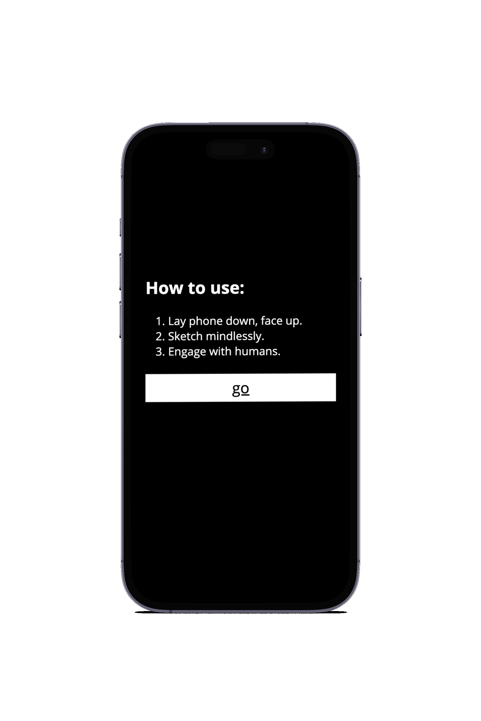
The concept for Mindless Sketches is actually very simple. It is a sketchpad, created using HTML, CSS and Javascript, designed for mobile use. Basically, the app only works when the phone is lying down, flat.
I’ve never been too attached to my phone, personally, so I seldom bring it out in mixed company. As such, it has always deeply grated me when someone else grabs for theirs when the setting doesn’t call for it. I mean, if you’re in line at the grocery store, by all means, scroll away. But when I see someone out to dinner, on a walk with a friend, in a work meeting, etc, I am mystified by the inclination to fiddle with your phone!
Darian Leader wrote a book called Hands: What We Do With Them and Why that sparked my curiousity on the subject. Leader suggests that the hands have their own agenda, that tapping and swiping and fidgeting is the result of a mostly unconscious gesture. I thought that if this was the case, if our hands really must have something to do, then I would create something that allowed them to do that without taking their primary attention away from other humans.
First, I thought about my own experiences with friends absorbed in their phones. I find the most offensive part of the act to be the physical barrier that a phone is between two people. I knew that I wanted the solution to be one that left the user to look their company in the face, and allowed the company to see that the phone was not pulling attention away from their present interaction. I thought the best solution for this would be to find a way to make the user leave the phone lying down.
![]()
I also knew that I did not want the experience to be one that was bright or flashy or otherwise distracting, so I worked with neutral colors.
By this point, I knew the user’s interaction (fidgeting), the experience’s role in its intended setting (background, lying flat), and the visual tone of the interface (neutral, not distracting). From there, the project practically put itself together.
![]()
I’ve never been too attached to my phone, personally, so I seldom bring it out in mixed company. As such, it has always deeply grated me when someone else grabs for theirs when the setting doesn’t call for it. I mean, if you’re in line at the grocery store, by all means, scroll away. But when I see someone out to dinner, on a walk with a friend, in a work meeting, etc, I am mystified by the inclination to fiddle with your phone!
Darian Leader wrote a book called Hands: What We Do With Them and Why that sparked my curiousity on the subject. Leader suggests that the hands have their own agenda, that tapping and swiping and fidgeting is the result of a mostly unconscious gesture. I thought that if this was the case, if our hands really must have something to do, then I would create something that allowed them to do that without taking their primary attention away from other humans.
First, I thought about my own experiences with friends absorbed in their phones. I find the most offensive part of the act to be the physical barrier that a phone is between two people. I knew that I wanted the solution to be one that left the user to look their company in the face, and allowed the company to see that the phone was not pulling attention away from their present interaction. I thought the best solution for this would be to find a way to make the user leave the phone lying down.
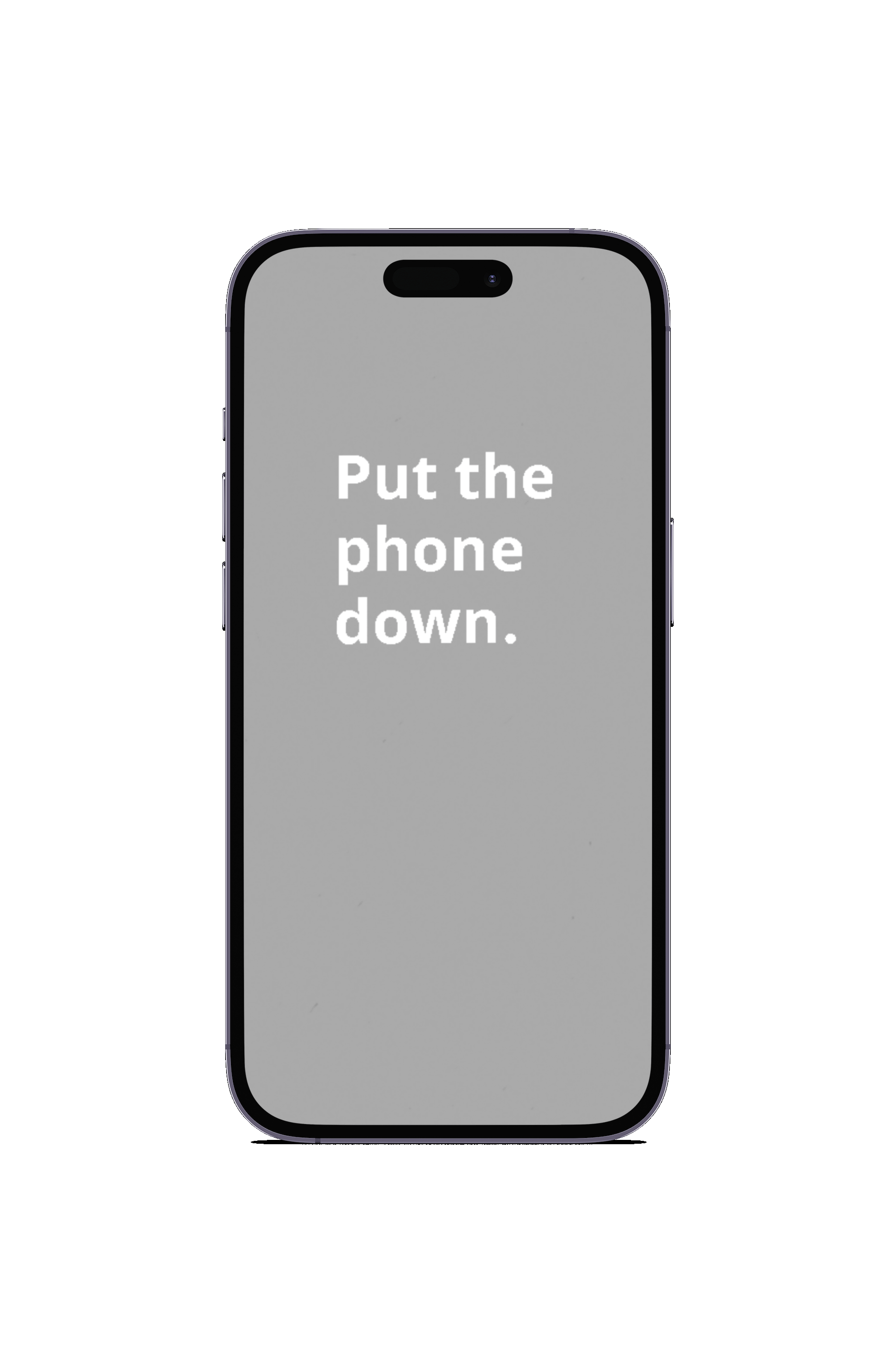
I also knew that I did not want the experience to be one that was bright or flashy or otherwise distracting, so I worked with neutral colors.
By this point, I knew the user’s interaction (fidgeting), the experience’s role in its intended setting (background, lying flat), and the visual tone of the interface (neutral, not distracting). From there, the project practically put itself together.
